“Designed and Made By”: The Book
152 page book about this project.
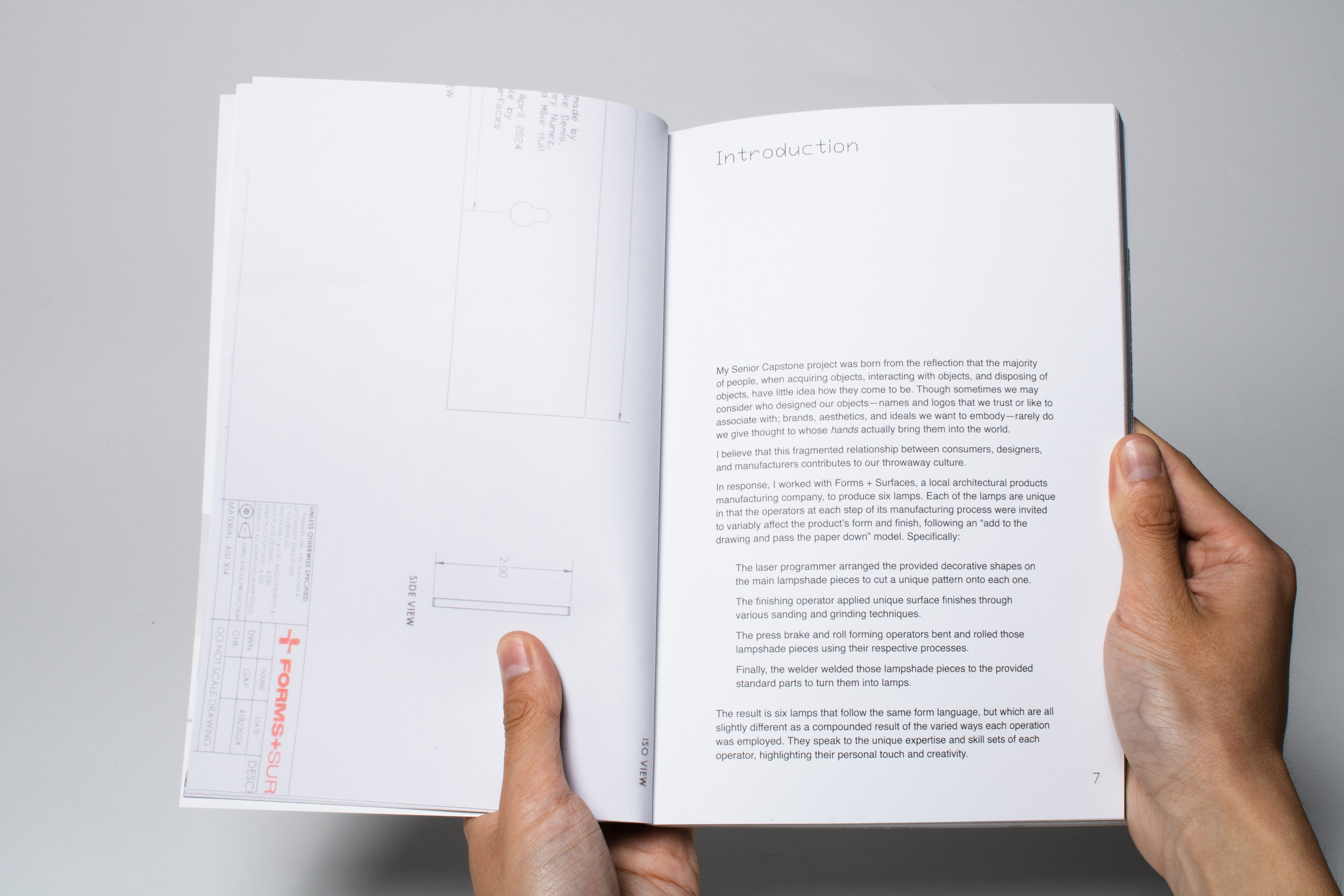
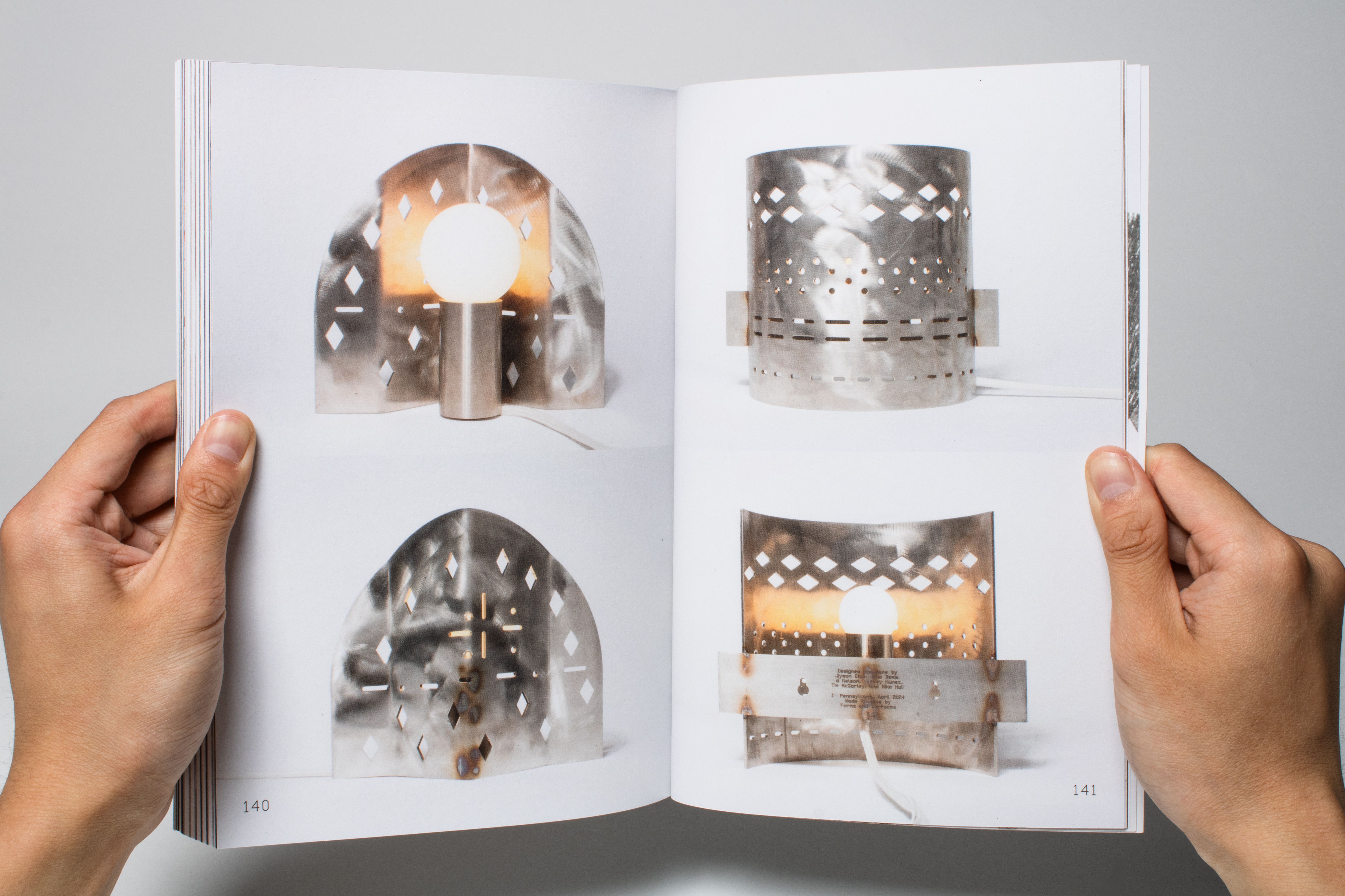
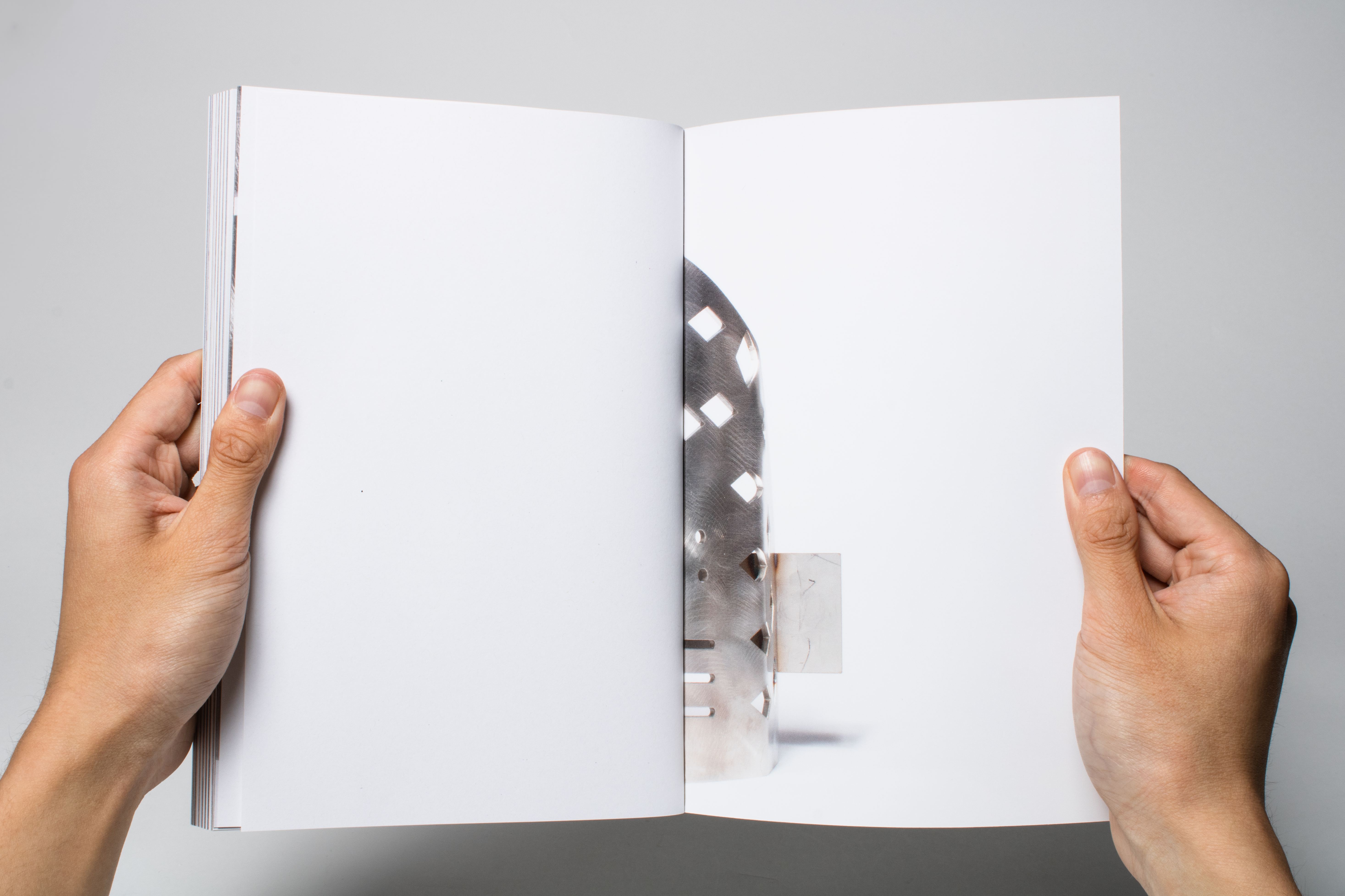
“The story of a lamp designed to be designed on the production floor, and the stories of the people who made them.”
Duration
March - April 2024Editorial/Book Design
Photography
Art Direction
Interviews/Portraiture
Adobe InDesign


Background
Concept-wise, the project was inspired by the likes of street portrait and interview photoblog Humans of New York, by photographer Brandon Stanton.
I’ve always been moved by how a simple portrait paired with written text of someone sharing a piece of their life can be so poignant.

Interviews and Portraits
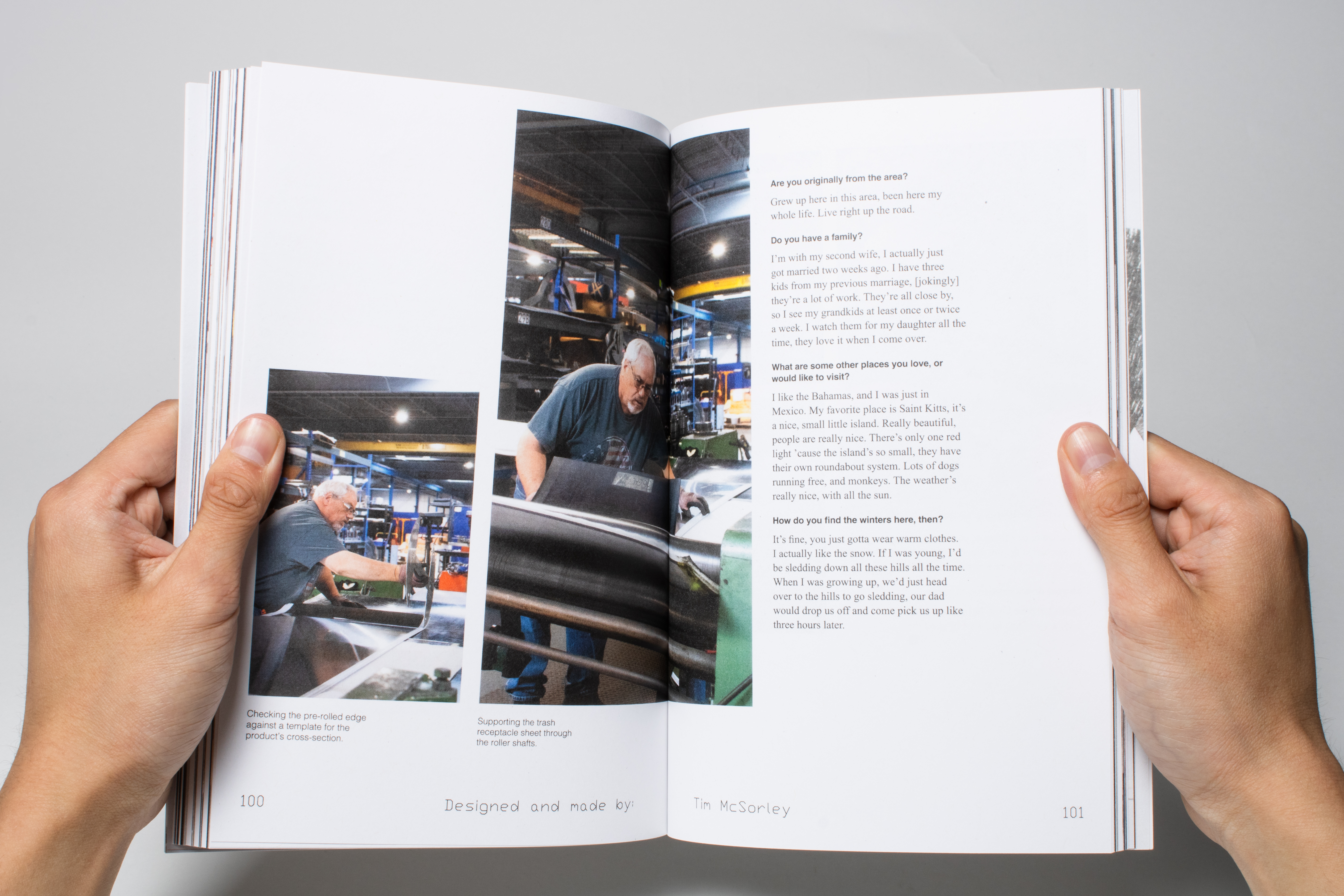
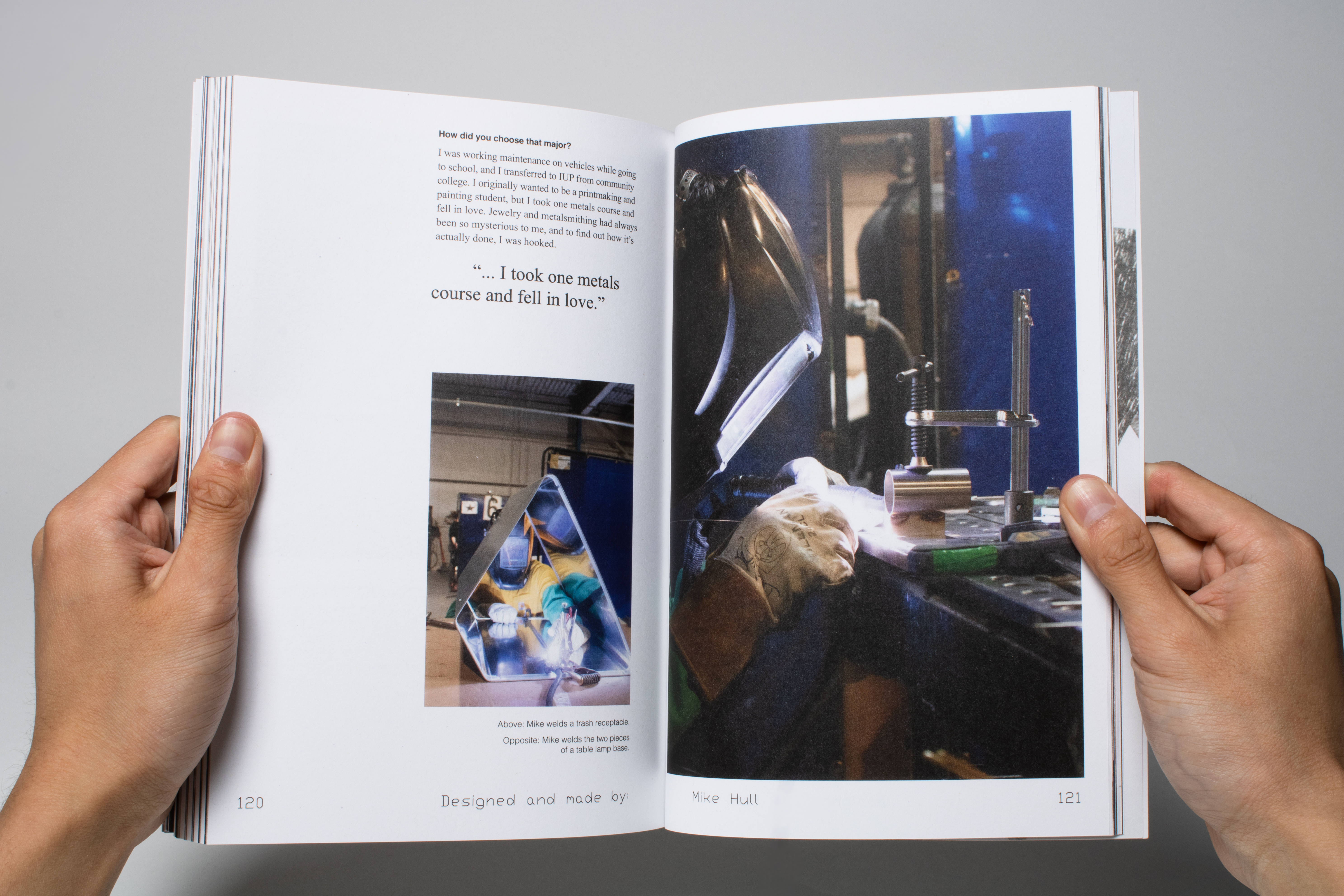
I wanted to ask questions that gave readers insight into the operators’ work and how they relate to it, but also their personal lives and backgrounds. I started with these questions (right), but from there tried to let the conversation flow naturally.
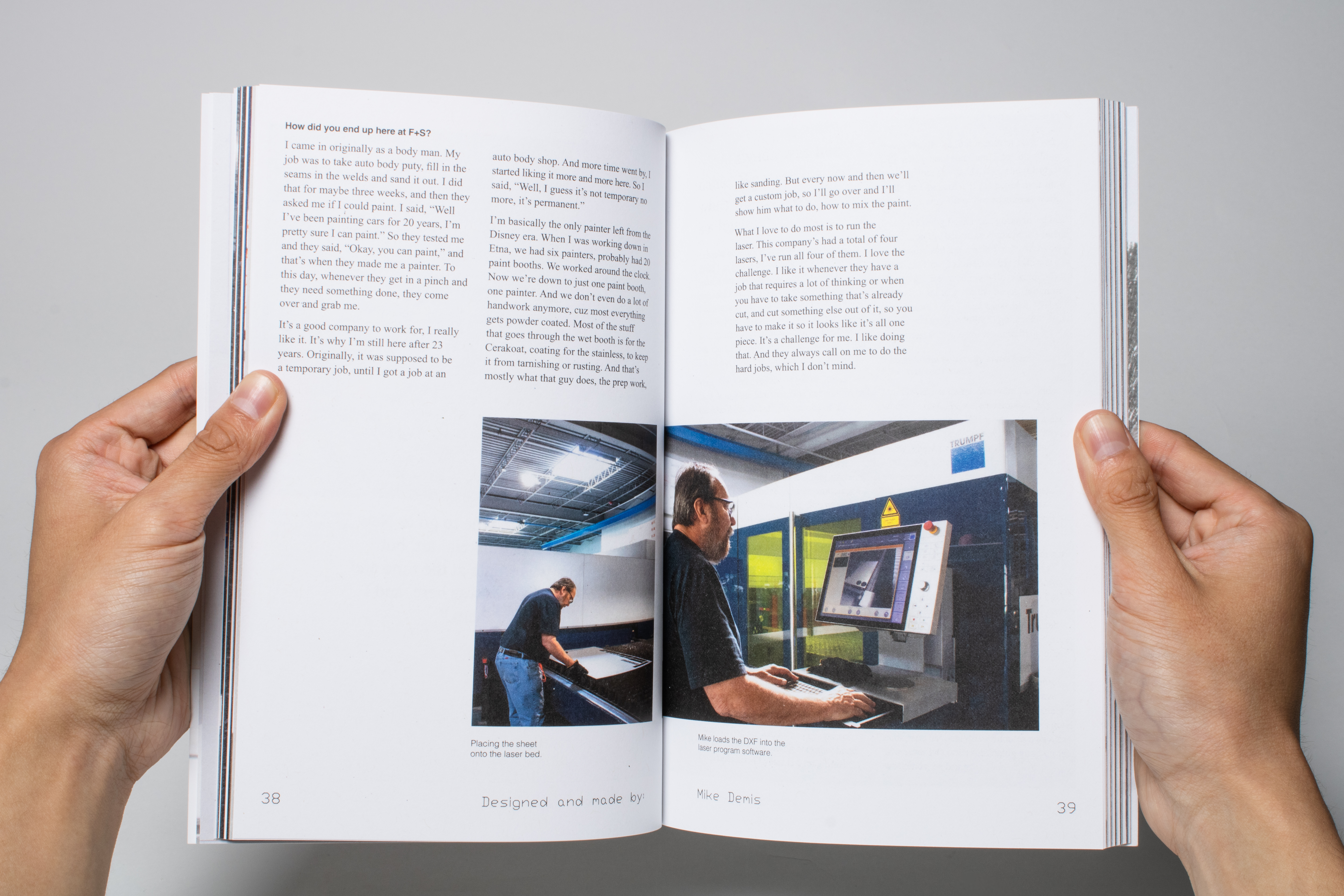
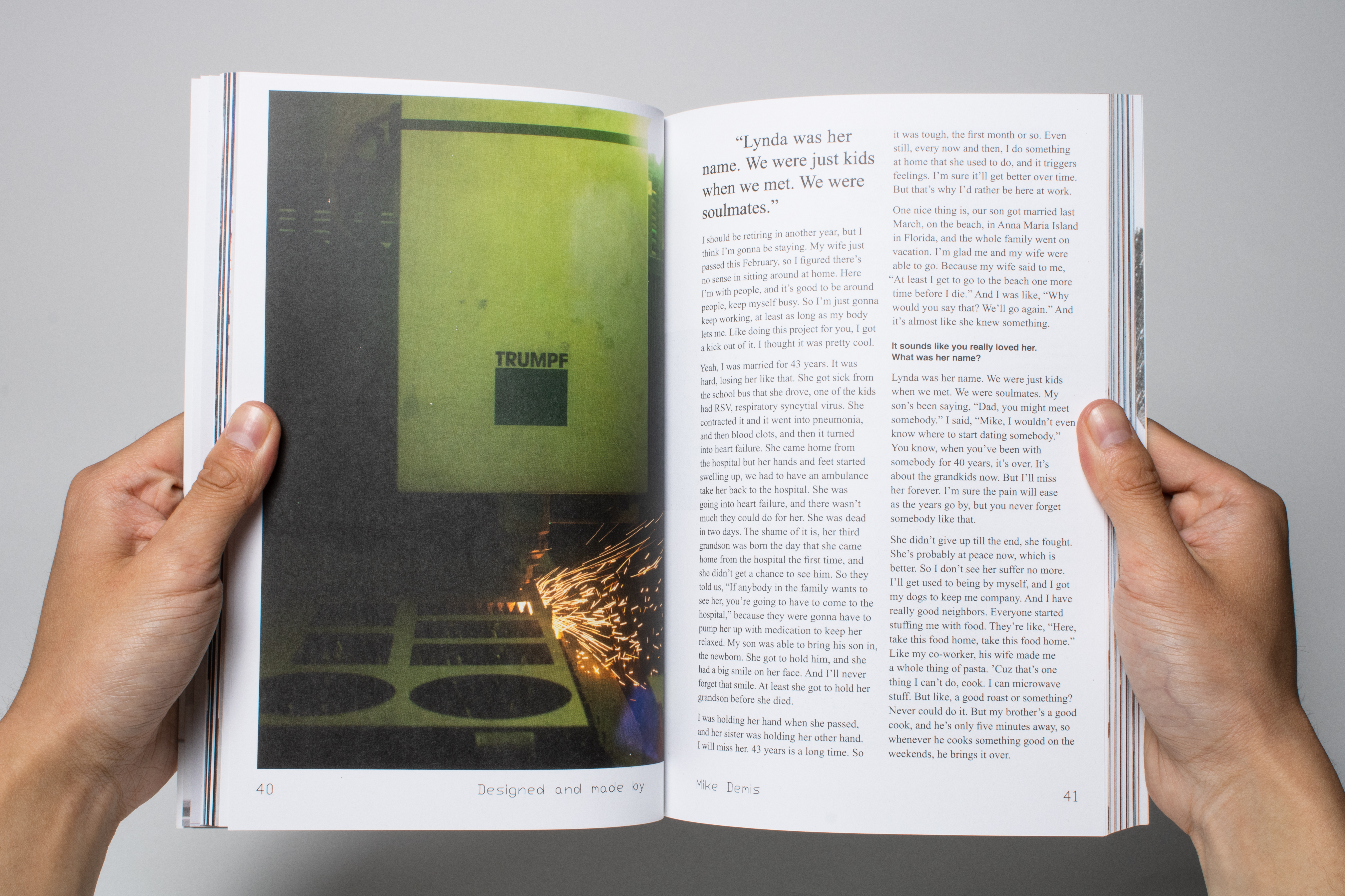
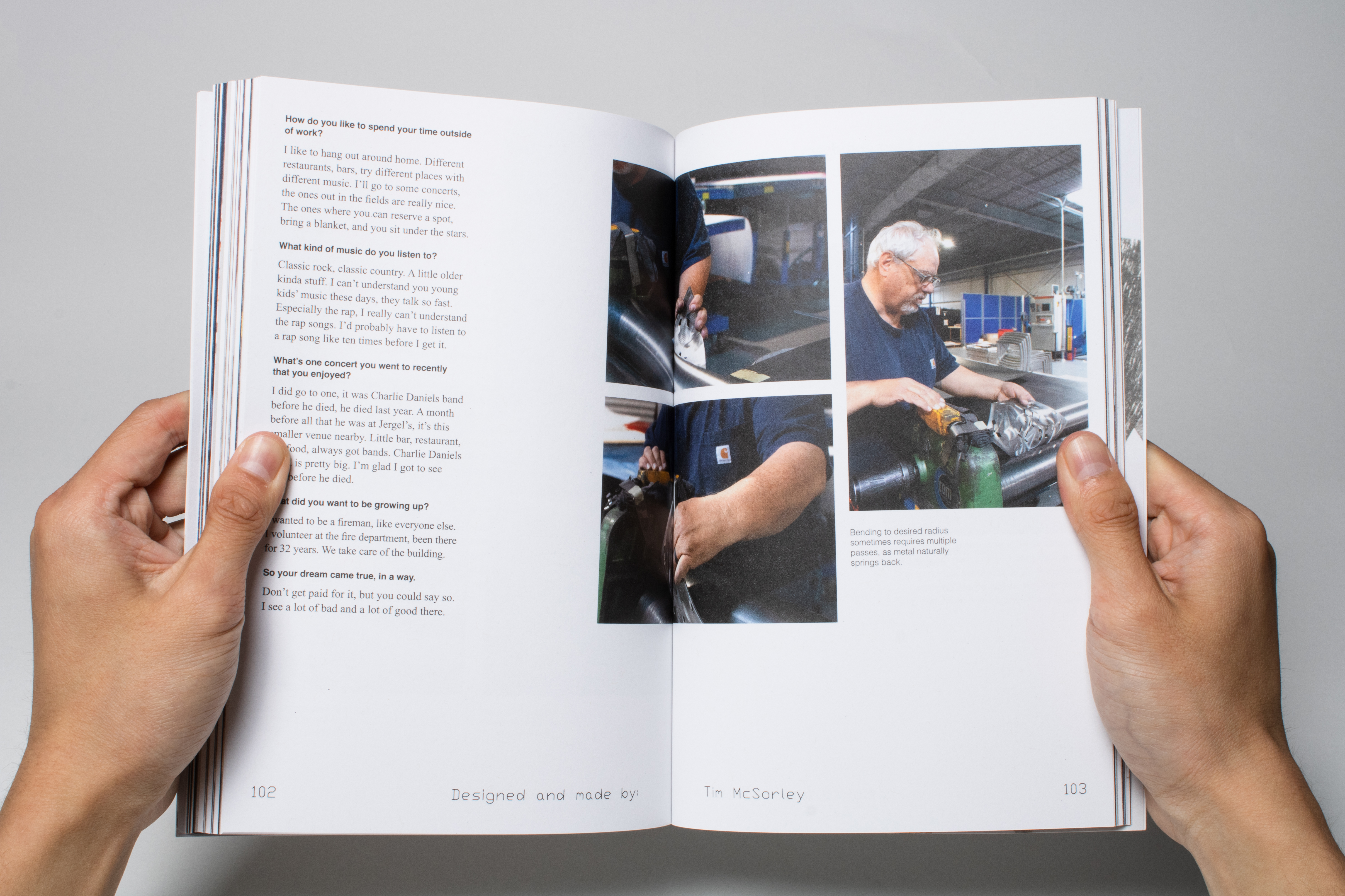
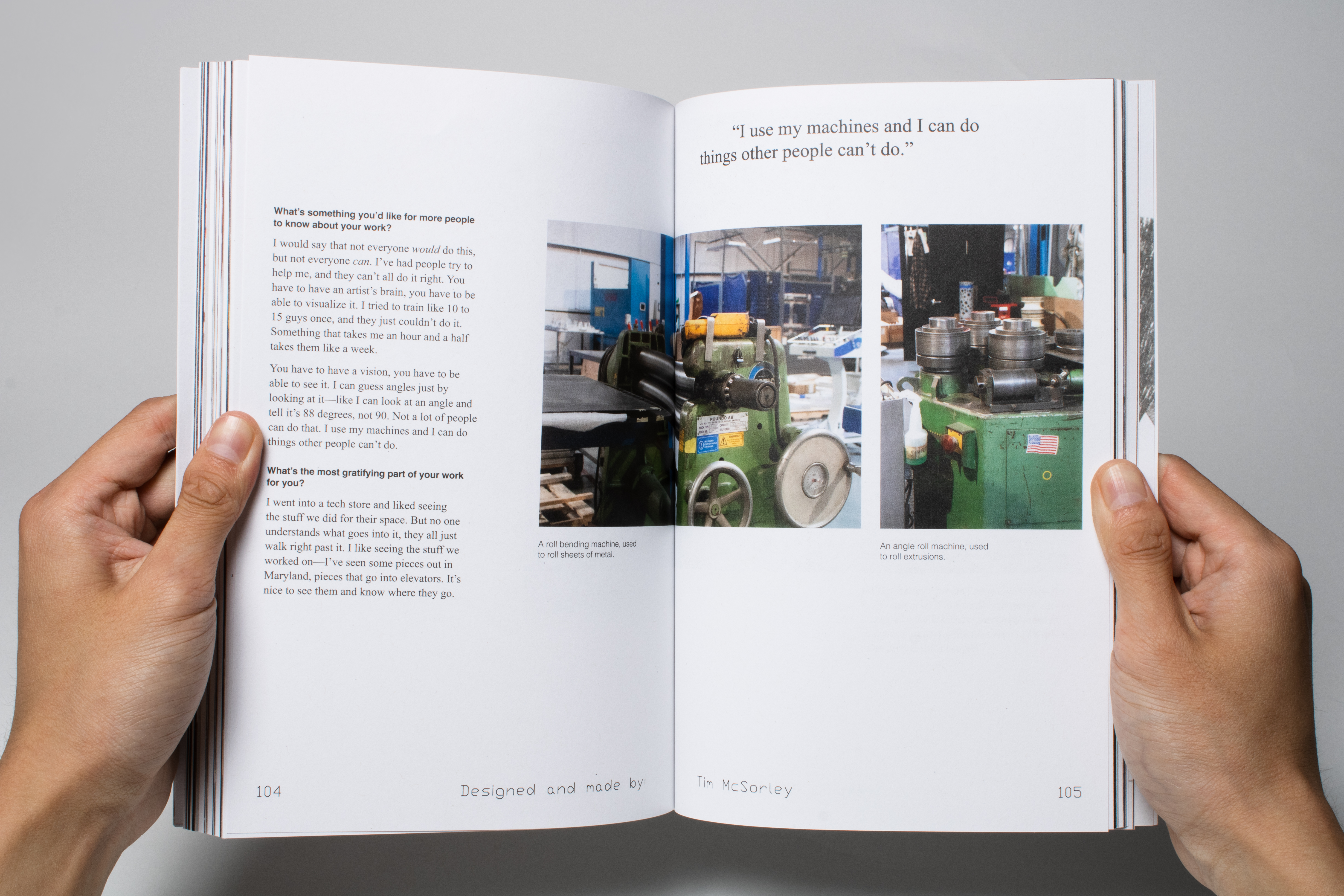
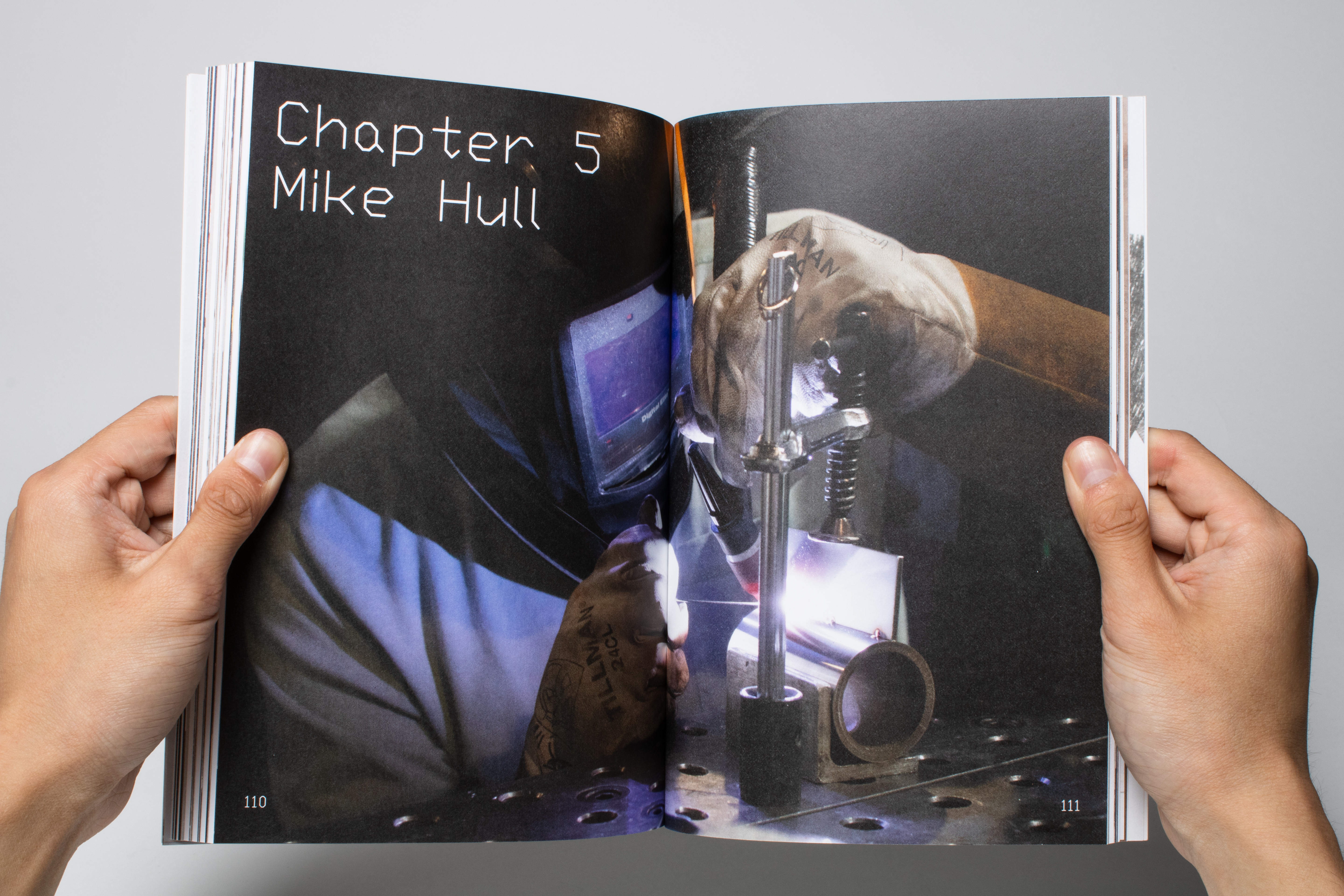
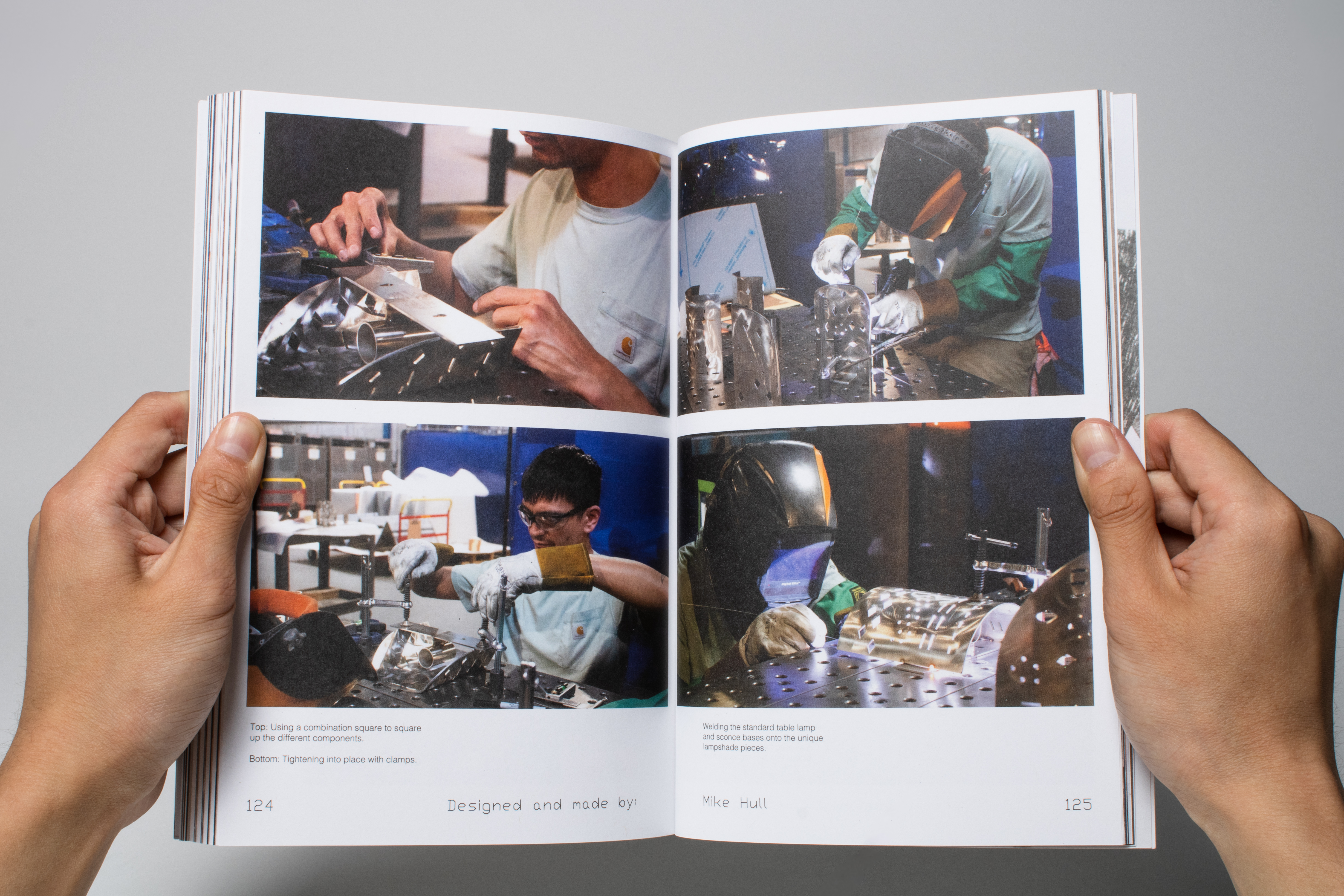
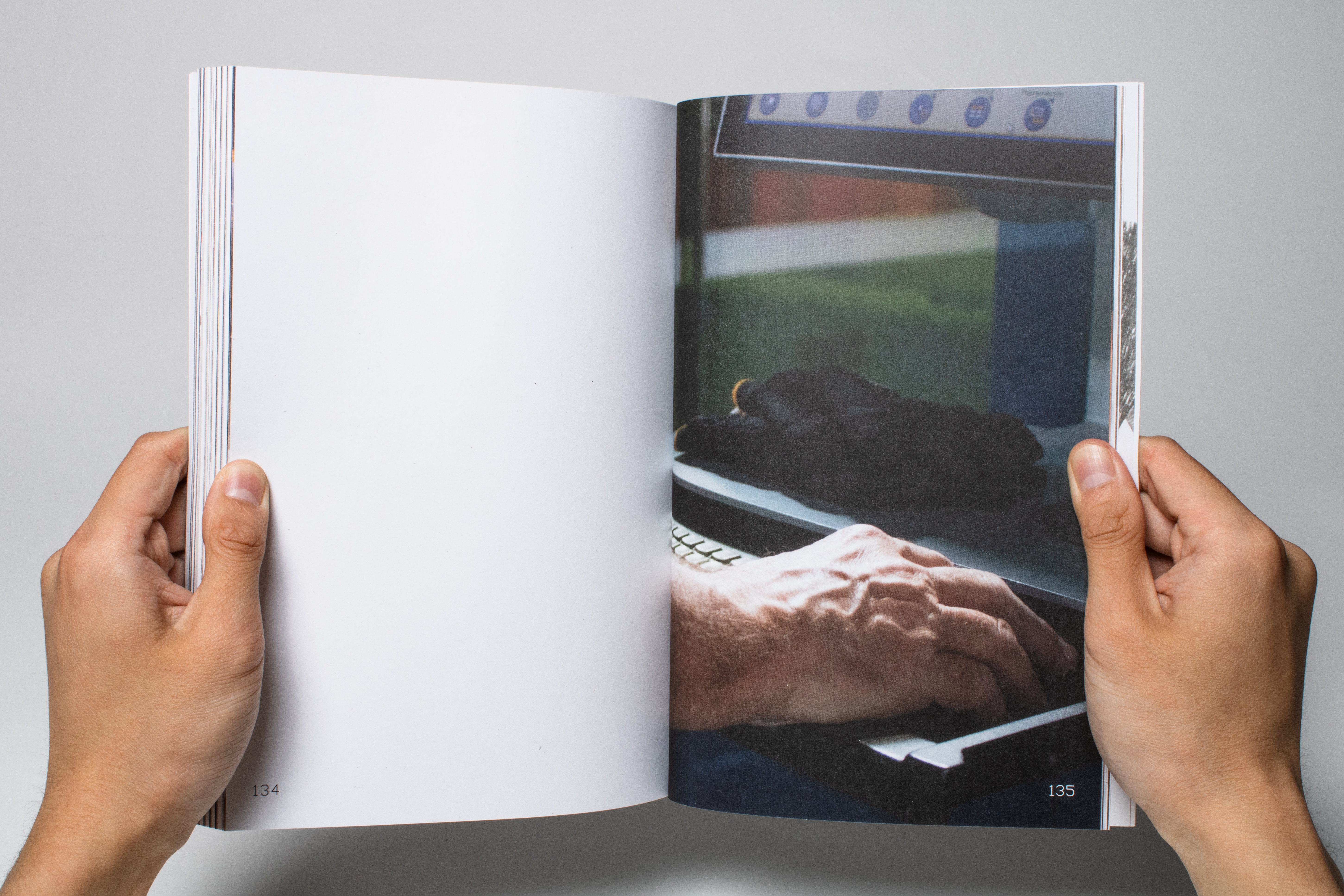
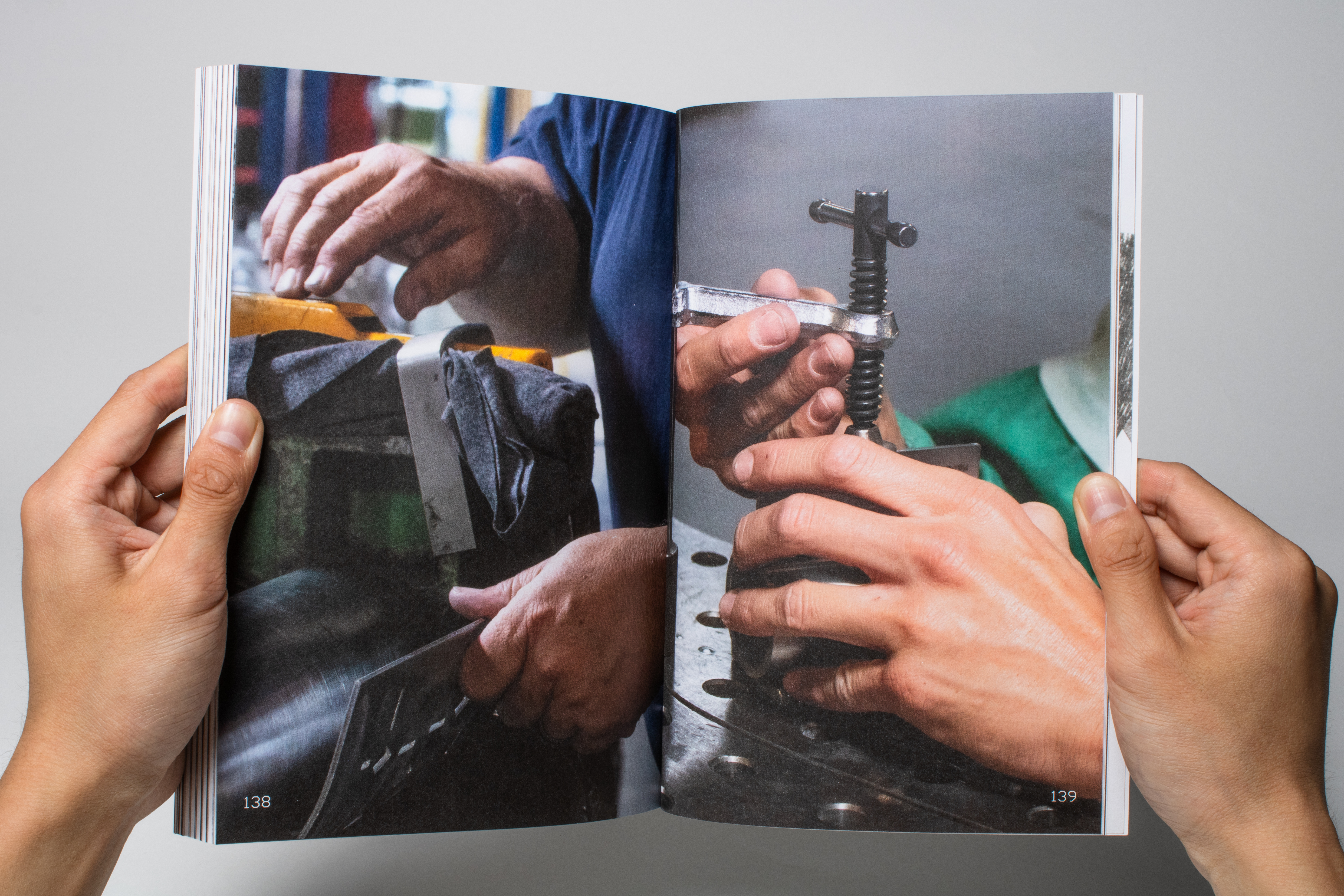
Portraits were taken both during these initial interviews as well as throughout the manufacturing process.
How long have you been at F+S?
How did you get into this industry?
What other things have you made or worked on?
Do you have a family?
What did you want to be growing up?
What’s the most gratifying part of your work for you?
What’s something you wish more people knew about your work?
References
Brett Yasko and Dylan Vitone lent me some of their books.
Others I found on the internet.
Researching approaches for:
Organizing interview material—

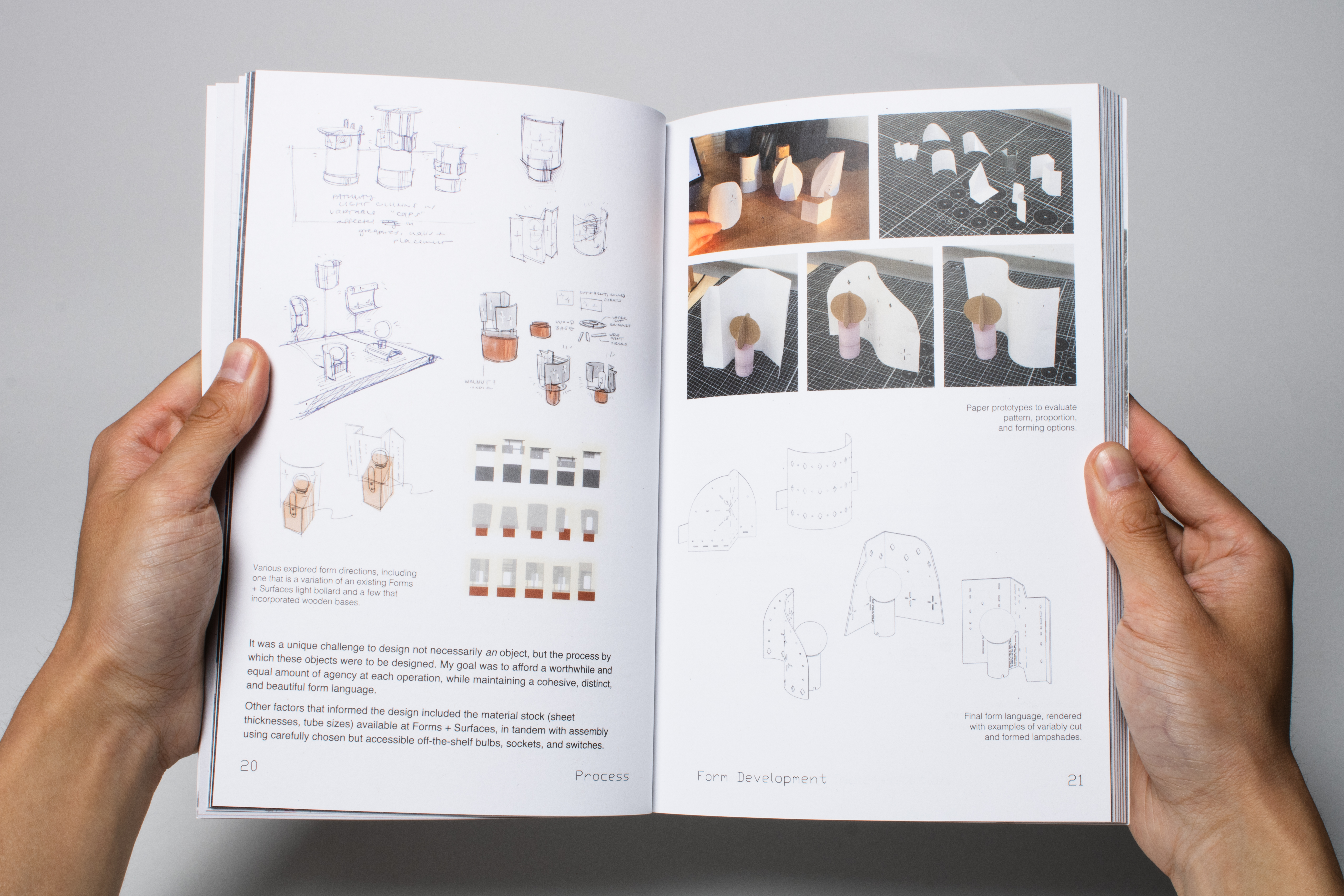
Treating other print materials as artifacts (scans, screenshots, diagrams, sketches)—


Page layouts for text and images—


Colophon
SWTxt is a typeface I discovered as a result of a software glitch while creating the DXFs (Drawing Exchange Format) with text for the laser engraved parts. Commonly used in AutoCAD software, it was designed for technical drawings and drafting purposes. Single stroke lines which bend at 90-degree and 45-degree angles also simplify toolpaths in manufacturing processes. It felt appropriate to use this mechanically-driven typeface as a structural element: folio, table of contents, titles, etc.
I chose Helvetica, a neutral, understated typeface, to represent my voice, which shows up primarily as interview questions.
Designed for newspapers, Times New Roman represents the voice of the people: in this case, the five operators.

I had the immense joy and privilege to give them each a copy at the end of the project.

See the entire project here.
I love industrial design but sometimes I think about books, and what might have been had I chosen the communications track instead of products during my sophomore year. Being able to do both with my Senior Capstone felt like two dreams come true.
I love industrial design but sometimes I think about books, and what might have been had I chosen the communications track instead of products during my sophomore year. Being able to do both with my Senior Capstone felt like two dreams come true.